Taiwan Wins One Gold Among 16 Prizes at iF Communication Awards 2008
2008/09/11 | By Quincy Liang
Besides turning in solid performances in global industrial design contests in the last few years, Taiwan again showed the international design community that its prowess reaches beyond product creation and innovation-winning a gold award among the 16 prizes at the iF Communication Design Awards 2008.
J.M. Lin, a locally-famous architect, led the Observer Design Group to create a communication project to highlight the 60-year history of the local China Times Media Group, which successfully captured the jury's attention to win the island's only gold award in this year's competition.
Another eye-catching winner is Proad Identity, a five-award winner at the fiercely contested global event.
According to iF Taiwan, the iF Communication Design Awards 2008 drew 1,290 entries from 16 nations (compared with 1,140 in 2007), with 310 winners honored: 68 in the digital media, 175 in the print media, 55 in the corporate architecture, and 12 in the cross-media categories.
Thirty iF gold awards were also given, with five projects also receiving special awards in the "Too Good To Be True" category.
According to the Taiwan Design Center (TDC), a national design center on the island, the results of all the iF design contests in 2008 show that Taiwan has won 99 prizes, a 77% increase from 56 in 2007.
As of early August, Taiwan has already won 166 prizes in the world's four most-coveted design competitions-iF, Reddot, Industrial Design Excellence Award (IDEA), and G-Mark-exceeding 133 in 2007, with hearing the results so far from G-Mark of Japan. As such, TDC believes the island is expected to bag over 200 prizes, a new record, from the top-four design contests this year.
The following details some of the prize-winning designs from Taiwan, courtesy of iF Taiwan, the local branch of the International Forum Design (iF) of Germany.
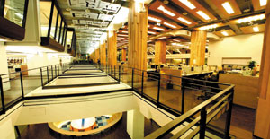
Design: J.M. Lin Architect / The Observer Design Group
Five decades after the establishment, the renovation of interior space at China Times group is both a physical makeover and a spiritual transformation. In redefining the characteristic of the space, the design team first preserves the essence of the former printing factory. For innovative design, the team creates an open and accessible space that accommodates creativity and ingenuity, thus to inspire a brand-new value of the globally local service. The renovated office area is a powerhouse for media workers, with efficiency-oriented office layout and mind-relaxing facilities, the process of seeking truth would still be strict, and more fun.
Prize: iF Communication Award
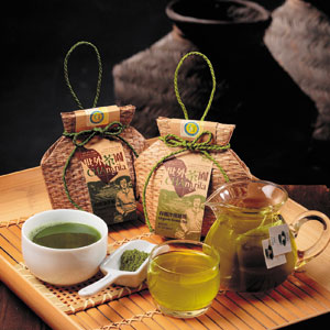
Project Name: CHAngrila Green Tea
Category: 2.7 print media - Product communication
Project Type: Packaging Design
Design: Arty Design
By renaming the brand with "CHAngrila", the proposal aims to reinvent the packing configuration of the conventional tea container by linking the styling directly to the tea handpicking impression; the packing material takes to the material of a paper fiber-woven paper rattan cage to meet the organic tea's environmental conservation concept, which can be flattened for transport and storage, and interlocks at the bottom automatically when formed to shape at the time of packing, without requiring adhesion.
Prize: iF Communication Award
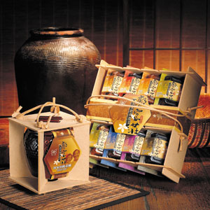
Project Name: GJZ Hakka Pickle
Category: 2.7 print media - Product communication
Project Type: Packaging design
Design: Arty Design
This package series utilizes Medium Density Fiberboard recycled from woodchips to form a simple product showcase. The see-through design affords a direct view of the goods on display, requiring no cover. The bullet-filling concept creates the flexibility for combination possibilities. This package series adopts single recycled material with few printing, and meets the regulations of excessive product packaging restrictions by Environmental Protection Administration (EPA) of Taiwan. This package series can be made as lampshades and lanterns afterwards, which helps the marketing and promotion. This design is the complete application of the 3R concept.
Prize: iF Communication Award
Project Name: Uncle Huan Mustard
Category: 2.7 print media - Produktkommunikation
Project Type: Packaging design
Design: Arty Design
Using the economic clay coated paper as the packing material where the background printed with the reports about the businessman, this package tells a good brand story by reappearing the daily fun of wrapping pickles with newspaper. For the product Steamed Pork with Preserved Mustard, we keep the rustic and environment-friendly packaging ideal and change the material of the bowl from PP to paper to totally reveal the very nature of this product. This design revives the old appearance of Taiwanese traditional pickles and dishes of 50 years ago by modern packing technologies, which recalls the customers' memory of traditional fine food.
Prize: iF Communication Award
Project Name: TAIWAN POST BOX
Category: 2.6 print media -- Corporate communication
Project Type: Mail Box
Design: Chart Design
TAIWAN POST BOX represents a significant change in package design in one hundred years. In simple lines, the passenger pigeon holds with its mouth a string that symbolizes the bond that brings loved ones close. The imagery shows Taiwan Post as a service that is warm, friendly and reliable.
Prize: iF Communication Award
Project Name: Wu-Mu Noodles
Category: 2.7 print media -- Product communication
Project Type: Packaging
Design: Proad Identity
The Genetically Reengineered Wu-Mu Noodles, in mixed Japanese styles, Wu Mu insists on grilling with bamboo charcoals and absolutely "no deep-frying". For years Wu Mu has stood as the No. 1 brand. In the process of image renewal, the company worked to save the elements consumers identify with for years and convey the image of upgrade and quality. Thus, the old logo stays conveying the traditional warm feeling of "Mother cooking a bowl of hot and healthy noodle for her child". The Japanese pleads form a cohesive theme and the package is upgraded into the Lohas style.
Prize: iF Communication Award
Project Name: Auspice Paper Co., LTD.-Paper Samples
Category: 2.3 print media -- Sales promotion
Project Type: Paper Brochure
Design: Proad Identity
Auspice Paper Company cuts trees by the tempo of the nature. The company makes the promise and are proud to be part of the sustainable development of the nature and eco-friendly energy. The special structure of the paper-pulps and surface-finishing regenerates papers with strength and brilliant colors. To present the paper's "Life (living with the earth)", "Poise (strength)" and "Expression (color presentation)" the books are presented by an interlaying design of papers of three different specifications in aesthetics of superior harmony. Bound in simple paperback the papers reveal the charm and the thought closer to the core of its origin.
Prize: iF Communication Award
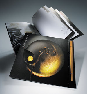
Project Name: Food Industry Research & Development Institute
Category: 2.3 print media -- Sales promotion
Project Type: Image of Processed Foods
Design: Proad Identity
The history of food is often very long. The taste of food is even better in a nostalgic setting. Hence, with ancient print-makings around and the surrounding of Tang poetry chanting, A Neoclassical environment is created with old elements and new techniques. The beauty of food transcends the boundaries of time and space, more than just a taste.
Prize: iF Communication Award
Project Name: 2008 Taiwan International Orchid Show
Category: 2.1 print media -- Image
Project Type: Image of Processed Foods
Design: Proad Identity
The orchids of Taiwan are world famous. They are the pride image of the beauty of Taiwan. The fabrics with prints of orchids are colorful and elegant. In paper materials, fabrics and packaging, Orchids take on a vivid life. The image of a new Taiwan is developing accordingly.
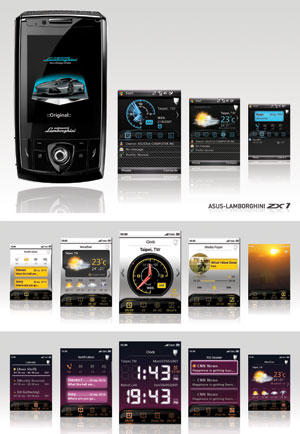
Prize: iF Communication Award
Project Name: ZX1
Category: 1.2 digital media - Atmosphere
Project Type: Mobile Phone Interface
Design: AsusTeK
Asus-Lamborghini, ZX1, aims for the high-end and fashion-conscious consumer. The concept of ZX1 is inspired by the dynamic and stylish Lamborghini brand. Echoing the classic editions to the Lamborghini, the GUI is encased in symbolic colors. Exclusively, by subtly transforming car's interior elements into visual language with 3D effects, the connection with Lamborghini can directly be found on the device, thereby creating a real-driving atmosphere and getting user in the mood when user operates ZX1. Besides, buttons that emerge according to functions based on their usability through touch and interaction create a familiar and tangible UE.